Racial Preferences on Campus: Trends in Asian Enrollment at U.S. Colleges

The Supreme Court has agreed to weigh in on the legality of racial preferences, in part thanks to a lawsuit against Harvard College alleging that the school discriminates against Asian-Americans.
Proving discrimination at a specific school is an arduous task, requiring access to private, detailed admissions records—as the legal documents in that case demonstrate. But this report takes a step back and focuses on a question that is both simpler and broader: As the Asian-American population in the U.S. has risen dramatically over the past 30 years, how has Asian enrollment fared at different types of colleges? This kind of analysis was a reason many became skeptical of elite colleges’ treatment of Asians over the past decade, and now it is possible to update the numbers that have been publicized in popular magazines and publications.
This report begins by showing that Asian-Americans are generally overrepresented at the highest levels of academic achievement, and that this overrepresentation has become more pronounced as the Asian share of the population has grown. Using federal data on college enrollment by race—but mindful of the limits of such data—it then sorts colleges according to their admittance rates and test scores for the purpose of tracking changes in the share of Asian students at different types of four-year colleges that grant bachelor’s degrees.
The upshot is that at most types of schools, a predictable pattern emerges: As the Asian share of the college-age population rose, so did the Asian share at these colleges, with the growth most pronounced at the most selective schools. At the very top schools, however, an odd pattern emerged. The percentage of Asian enrollment stagnated around the mid-1990s but then began to grow again around 2010, with the exact patterns shifting slightly depending on how the numbers are calculated.
These are, to be clear, descriptive exercises using less-than-perfect data, and they do not prove discrimination at any specific school. But they are certainly consistent with claims that elite schools in general worked to limit the number of Asian students admitted in order to avoid overly skewing their campuses’ racial balances—and perhaps backed away from this practice as the Harvard lawsuits and other efforts drew attention to the allegations.
Introduction
The Supreme Court has agreed to hear challenges to the affirmative-action policies of Harvard and the University of North Carolina,[1] and it will likely take the opportunity to rethink the legal status of affirmative action on a fundamental level.
But the Harvard lawsuit, especially, draws attention to a dynamic that until recent years had played a relatively minor role in the affirmative-action debate: the treatment of Asian-Americans under systems of racial preferences. Those suing Harvard allege that the school discriminated against Asians—not just by denying them the preferences given to underrepresented groups such as blacks and Hispanics but also by treating them worse than similarly qualified whites. It’s hard to prove such a thing without full access to a college’s admissions records, and thanks to the discovery process, the Harvard lawsuit has featured detailed statistical analyses from dueling expert economists.[2]
The plaintiffs’ expert, Duke economist Peter Arcidiacono, finds that Asians need higher qualifications than whites to be accepted to Harvard. (The defense’s expert, Berkeley’s David Card, naturally disagrees.[3]) Arcidiacono also notes that Harvard would be majority-Asian if admittees were simply drawn from applicants with top-decile “academic index” scores, rather than filtered through a “holistic” admissions process. Similarly, Yale data released in a Department of Justice lawsuit showed that the school has more Asian applicants with top-decile academic scores than it has white, black, and Hispanic applicants with such scores combined.[4] These findings mirror earlier work by Thomas Espenshade and Alexandria Walton Radford that suggested that Asians needed considerably higher qualifications than whites to get into a group of highly selective schools, though Espenshade cautioned that the analysis does not provide a “smoking gun,” as it excludes such control variables as teacher recommendations and extracurriculars.[5]
In the early- to mid-2010s, numerous observers drew attention to similar patterns in Ivy League admissions using publicly available data. While the college-age Asian-American population rose substantially between 1990 and 2010, Asian-American representation stalled out at these highly selective schools by the mid-1990s, thereafter typically falling in the range of between 10 and 20%. It seemed as if someone had decided that an Asian share above that range would be too much.
A chart in a 2012 American Conservative article plotted data on the Ivies’ Asian shares, alongside the numbers for the California Institute of Technology (Caltech), a selective school that doesn’t practice affirmative action.[6] The New York Times even hosted a discussion about the numbers.[7] The lawsuit against Harvard was filed in 2014, relying in part on these data,[8] and the following year, the Economist reproduced the chart.[9] The Center for Equal Opportunity in 2018 released a similar analysis comparing enrollment trends at Harvard, the Massachusetts Institute of Technology (MIT), and Caltech.[10]
Today, it’s possible to update these numbers and track Asian enrollment at different types of colleges in a more systematic manner, bearing in mind that the federal data on college enrollment is hardly perfect, and that any system for categorizing colleges is inherently arbitrary. A key development is that the share of Asians at highly selective schools—which serve a small proportion of all college students but play an outsized role in shaping the future American elite—appears to be on its way up again, perhaps in response to all the pressures exerted by the publicity about the lawsuits.
But first: What should we expect Asian enrollment trends to look like?
The “Fanning Out” Pattern: The Statistics at the Root of the “Problem”
When it comes to college-admissions patterns by race, there are two key facts about Asian- Americans. First, they are a small but quickly growing share of the college-age population, accounting for roughly 3% of American 18- to 22-year-olds in 1990 but 6% by 2020.[11] And second, as a group, Asian-Americans measurably outperform other demographic groups on numerous academic metrics. On average, Asian students get higher GPAs, score higher on standardized tests, and even report longer study hours than do students from other racial and ethnic groups.[12]
An important statistical concept here is that when one group scores somewhat higher than another on average, the difference is often more pronounced at the extremes. In other words, even if a randomly selected Asian-American student has only somewhat higher academic achievement than a randomly selected non-Asian student, Asians may be hugely overrepresented among the very highest achievers.
In 2019, for example, Asian SAT-takers scored an average of 637 on math and 586 on reading and writing; the averages for all test-takers were 528 and 531, respectively.[13] (Though bear in mind that test-takers are self-selected, mostly taking the tests because they want to go to college.) In statistical terms, the “standard deviation” (SD) of each SAT test is about 100,[14] so the difference is roughly one standard deviation for math and just half a standard deviation for reading and writing. In practical terms, these are not categorical differences: plenty of non-Asian students outscore plenty of Asian students on these tests, and indeed, this would be the case even if the two groups were the same size.
But as a 2017 Brookings Institution report explained, “Race gaps ... are especially pronounced at the tails of the distribution,” with Asian students accounting for an incredible 60% of those scoring 750 to 800 on the math section of the SAT that year.[15] To be fair, that’s a truly extreme example: Asian students disproportionately take the SAT rather than the ACT,[16] likely due in part to the geography of test preference.[17] The math SAT has a particularly large gap between Asians and other students, and in 2017, a 750 math score would have put a student above the 25th percentile at nearly every college in the country that reported its SAT distribution to the federal government. (The handful of exceptions included Caltech, MIT, the University of Chicago, Harvey Mudd College, Rice University, and Washington University in St. Louis, but no Ivy League schools.)[18] Yet, like the analyses of Harvard and Yale applicants noted above, this shows how a small minority group can constitute an outright majority of some highly selected subsets of the population.
These concepts have striking ramifications if such a group increases in size over time. We can illustrate those ramifications statistically using the concept of a “normal distribution,” or bell curve, in which most people are roughly average but extremely high or low values become increasingly rare at the tails, as is typical for many traits. (Additionally, standardized academic tests are typically designed to produce normal distributions in scores.) In a normal distribution, 68% of people will fall within one standard deviation of the mean, 95% within two, and 99.7% within three.[19]
Imagine that a minority group outperforms the rest of the population by just half a standard deviation on average, and that this group steadily grows from 3% to 6% of the population over the course of 30 years. How would that group’s representation change among students with average qualifications (with “average” defined as the average of the rest of the population)? What about students with qualifications one, two, or three standard deviations above average, meaning at the 84th, 97.7th, and 99.87th percentiles of the rest of the population? FIGURE 1 shows how the numbers shake out:
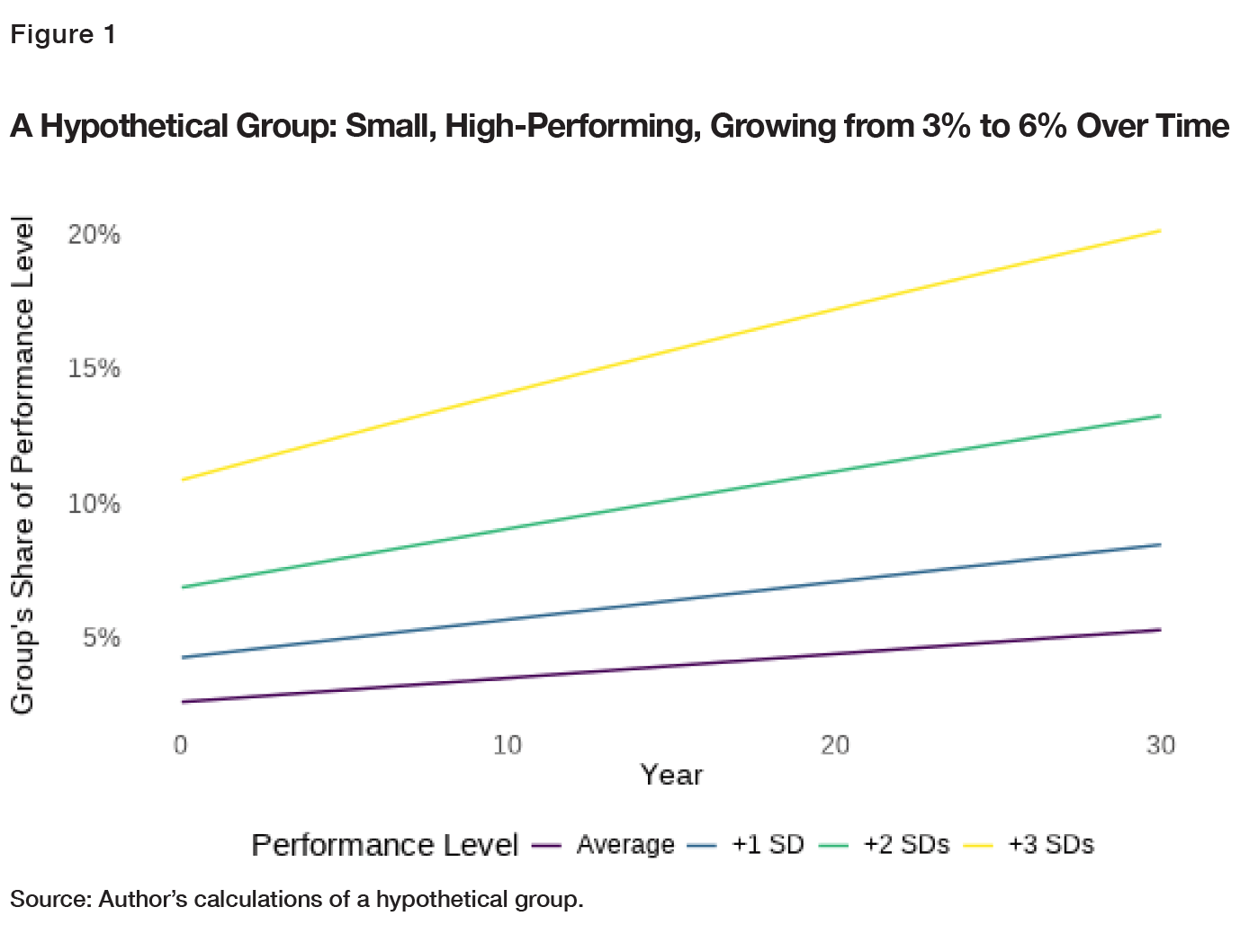
Notably, it is not the case that each share simply doubles along with the general-population share. (After all, if the Asian share of the general population doubles from its 2017 level, Asians will not go from 60% to 120% of 750+ scorers on the math SAT—so there cannot be a precise one-toone relationship between the two.) But when the high-performing group starts out this small, its share at various levels of the distribution “fan out” over time as it grows. As the group’s share of the general population rises just 3 percentage points, from 3% to 6%, the group increases from 7% to 13% of those with +2 SD qualifications, a difference of 6 percentage points—and from 11% to 20% of those with +3 SD qualifications, a difference of 9 percentage points.
Obviously, this is a simplistic exercise that does not map directly and unfailingly onto Asian- American enrollment in selective colleges. Real data never look that tidy; group differences can change over time (indeed, Asians have increasingly outperformed others on standardized tests).[20] Other groups’ shares of the population have shifted as well, and black and Hispanic students have increasingly gone to college (though the additional marginal students largely attend two-year, non-degree-granting, or less-selective institutions).[21] Colleges can change the qualifications they select for or the degree to which they practice affirmative action for underrepresented groups, and the strong presence of international students at many schools complicates the analysis. While “Asian” has long been a convenient category in the U.S. context, Asian-Americans come from many different places on an enormous continent.
Further, the half-a-standard-deviation academic gap is chosen just for illustrative purposes, and when dealing with extremes, modest shifts in the overall gap can make a dramatic difference. Make it a full standard deviation, and the minority group’s share of those with +3 qualifications at Year 30 rises to 44%; make it a quarter of a standard deviation, and it falls to 12%.
The important thing here, then, is not the exact level of the minority group’s share or the clean mathematical perfection of the lines illustrated in FIGURE 1; the important thing is the overall fanning-out pattern. It suggests that when the overall population share of a small minority group rises, its representation should generally rise even faster in settings where it is overrepresented. And this, in turn, means a small but growing group can cause great worry for those who want to see racial proportionality in all areas of life.
We’re not limited to statistical speculation here. We can confirm this pattern in some data on high-school achievement and overall educational attainment. As the Asian share of the general population has grown, the Asian share of the highest academic achievers has grown even faster.
Fanning Out in Real Data
Math and Reading Proficiency
The National Assessment of Educational Progress is a test given to K–12 students and nicknamed the “Nation’s Report Card.” These data capture not only the growth of the Asian population but also the rise in Asian test scores over time. An important limitation of the test, however, is that while school and student participation in NAEP are high, they are not 100%. Especially at the 12th-grade level, not all schools participate, and not all students in participating schools take the test. School participation has also grown over time, which further complicates the analysis of trends.[22]
By using NAEP data and some simple math,[23] it’s possible to calculate the Asian share of students at each NAEP “proficiency” level in reading and math at regular intervals over the past 30 years, using scores for 12th- and 8th-graders.[24] (The 12th-grade math data start in 2005, so we must look at 8th-graders as well if we want a longer-term view. The 8th-grade data also boast higher participation rates, reducing concerns about bias in the sample of tested students.) This is illustrated in FIGURE 2. The fanning-out pattern is clear, though it’s notable that for 12th-grade reading scores, Asian students did not clearly pull ahead of others until partway through the 2000s.
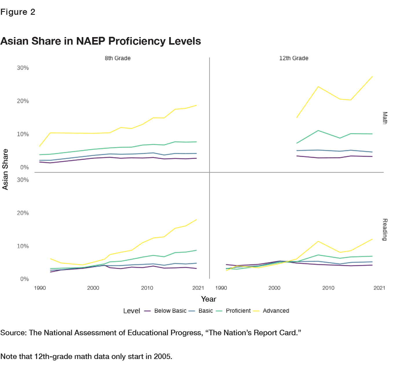
Further note that while the top category, “advanced,” is selective, it’s not extremely so. The numbers vary by test and year, but generally 2–10% of all students are considered advanced. By comparison, the Ivy League enrolls about 60,000 undergrads each fall, while there are more than 17 million 18-to-21-year-olds—meaning these schools welcome only about 1 in 300 Americans in this age range.[25] Additionally, a greater percentage of students have scored in the advanced category over time on these tests, meaning the upper categories have become less selective.[26]
Performance on Standardized Tests
A recent Georgetown study reported a somewhat similar exercise with SAT scores (plus ACT scores converted to the SAT scale) drawn from the National Postsecondary Student Aid Study, a combination of survey and administrative data on college students.[27] It found that the Asian share of those scoring 1350+ (excluding foreign students on visas) held steady at 12% through the 2000, 2008, and 2012 collections of data, rising to 15% only in 2016, which the authors found consistent with trends in the Asian share at selective colleges. However, the confidence intervals for these estimates are wide, with the 2000 interval running from about 8% to 15%, making any strong claims about the actual underlying trend dubious.
Further, the authors used a “historical” version of the race variable (where multi-racial students had to select a single race) to calculate the Asian share of those scoring 1350+ in 2000,[28] which had been intended for comparison with earlier, not later, surveys, and which did not contain a multiple-race category.[29] Running a similar analysis myself using the online tools the government provides for the survey—but with the same variables used in the calculations for each year—I get point estimates that round to 11% in 2000, 12% in 2008, 13% in 2012, and 15% in 2016, more of a steady rise than stagnation followed by a spike, though with the same major caveat about wide intervals making the underlying trend impossible to pin down with any confidence.[30]
And calculating for a wider variety of test-score ranges[31]—setting the top category to begin at 1400, and again bearing in mind the imprecision of the estimates—the Asian share among the highest scorers again breaks away from the pack (illustrated in FIGURE 3), though the fanning- out pattern is not obvious for the lower categories.
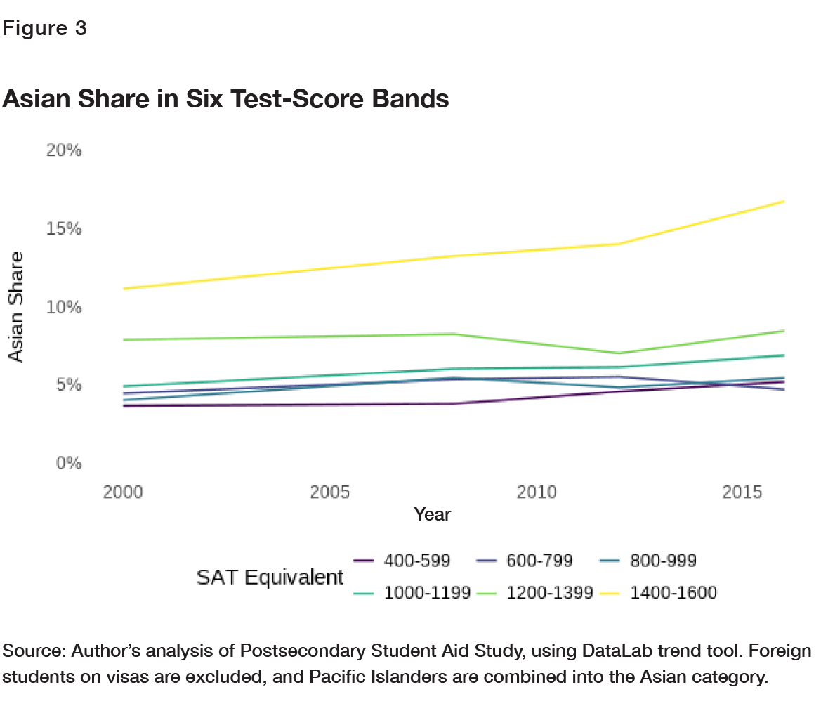
Like the “advanced” category on the NAEP, the 1400 SAT (or equivalent) cutoff is selective but not extreme. In 2019, 7% of SAT-takers scored at least a 1400.[32]
The Homework Gap
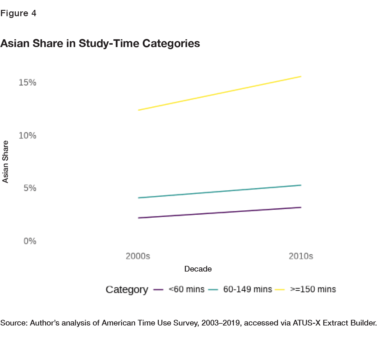
Meanwhile, the American Time Use Survey can give us a sense of how much time full-time highschoolers (age 15 and up) spent studying from 2003 to 2019,[33] though thanks to low sample sizes, I combined the data into just two periods, the 2000s and the 2010s.[34] Respondents to this survey provided detailed information about what they did on a single day. Over the whole period, about 10% of high-schoolers say they spent at least two and a half hours on “homework and research” on the day in question, with roughly another 20% saying they spent 60 to 149 minutes on such activities. Asian students—whose share of the time use survey results are illustrated in FIGURE 4—are overrepresented in both of these categories. Students in general have done a bit more homework over time, so the top categories become somewhat less selective in the second decade.
High-school GPAs are somewhat harder to analyze over time, given limited public data—not to mention the rampant grade inflation that increased the average GPA of a high-school grad all the way from 2.68 to 3.11 over 30 years, meaning a straight-B student is today below average.[35] However, Asian students’ mean GPA has run higher than other groups’ by consistent margins over time in the High School Transcript Study (with data running from 1990 through 2019), about one-quarter of a point on a four-point scale, despite the fact that Asian students tend to take more rigorous classes.[36] Combined with the rising Asian population share, this would be expected to create the same fanning-out pattern as seen elsewhere.
Educational Attainment
We also see the fanning-out pattern in educational attainment, which the U.S. Census Bureau measures[37] in numerous categories (though without regard to the quality of a school; a BA is a BA, whether from Harvard or anywhere else)—despite the fact that other groups with historically lower attainment have increasingly attended college, too.[38] FIGURE 5 illustrates the Asian share of those with a BA, those with more than a BA, and those without BAs among Americans age 25–39.
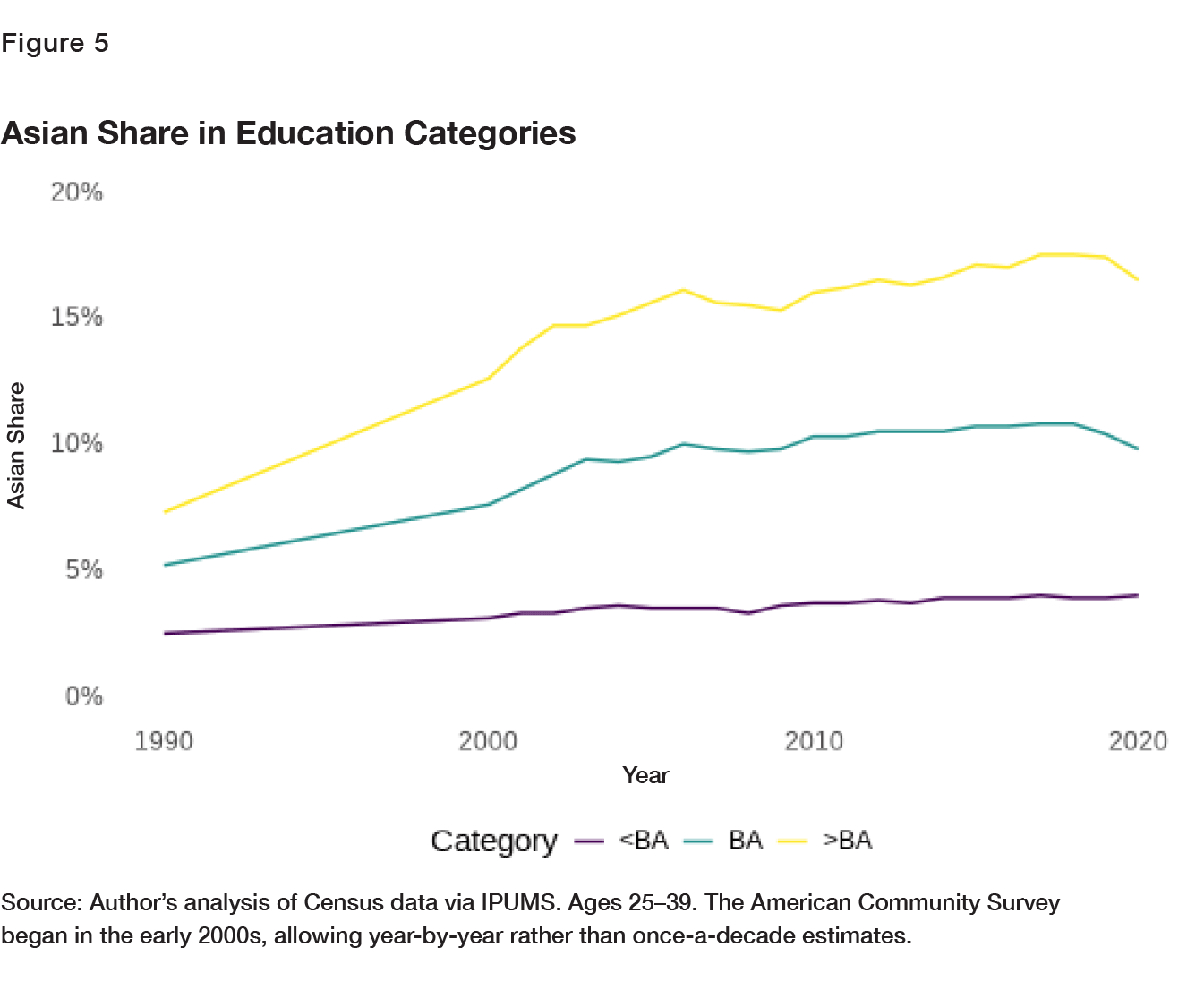
In short, the Asian share of the overall population remains relatively small, but it is growing, and the Asian share is far higher—and growing faster—among many highly selected educational subsets of the population. Asian students are strongly overrepresented among those who study long hours and score well on tests, and Asian adults are strongly overrepresented among those who earn degrees beyond a BA.
In highly selected populations, we should generally expect to see high and growing Asian shares, albeit with allowances for the facts that the world is complicated and real-life data never look perfectly tidy. Let’s bear all that in mind as we look at some data on college enrollment.
Enrollment Trends at Colleges
Categorizing colleges is inherently arbitrary, and the federal data on colleges are hardly infallible; they are self-reported, and some schools’ numbers are spotty or erratic.[39] Different measures have different pitfalls. Ranking colleges based on test scores will elevate schools that rely most heavily on those very test scores (and less on other factors, from GPA to “personality” to parental wealth to race itself), while ranking schools based on their rejection rates will elevate the elite military academies (which of course attract and select students based on different qualities from most other colleges) along with the Ivies and other schools we stereotypically imagine when thinking of “top colleges” in general. Smaller colleges will also have to get fewer applications to reject a given proportion of them.
Nine Rules of the Analysis
For the following exercises, I classified schools’ enrollment shares by these rules, using the federal IPEDS data accessible through the Urban Institute’s “educationdata” package, which is free to use in the computer program R and allows for easier analysis and replicability than the federal government’s own data portal:[40]
- I focus on the undergraduate fall enrollment of full-time, degree-seeking students at schools that grant bachelor’s degrees, for the period 1990 to 2020, excluding 2000 owing to a quirk of the data for that year.[41]
- The race categories in the federal data shift in 2010, counting Asians and Pacific Islanders separately rather than combining them and adding a “two or more races” category.[42] For purposes of continuity, I sum Asians and Pacific Islanders in the later years, but the changeover still results in a slight drop in the Asian share for many schools in 2010.[43] Schools that lack complete enrollment data for the 1990–2020 period are removed.
- The data contain two categories of students with no racial identification: “nonresident aliens” and a generic “race unknown” category, which also shifted somewhat with the new system. (For example, colleges no longer provide an explicit “prefer not to answer” option when surveying students.) While these categories are small, they do have the potential to affect trends somewhat. The “race unknown” category grew increasingly common from the mid-1990s through the 2000s, rapidly dropping off thereafter with the new system, and was especially prevalent at the most selective schools (though still just under 10% at its peak in 2009), according to a 2020 study that analyzed the problem in detail.[44] Further, one possible cause of missing race information is that some white and Asian students are reticent to identify their races to schools that practice affirmative action. There is no perfect way to handle this issue; the missing races are lost to time (barring efforts to link schools’ detailed student records with other data sources), the main options are limited to removing these students or not, and existing work varies. I’ve decided to have it both ways: My main analyses use total enrollment as the denominator, but the charts are recreated in Appendix 1 with the race-unknown and international students subtracted. These document, respectively, the percentage of all students who are known to be Asian, and the percentage of students with known races who are Asian. Except where noted, the results are generally similar for both. Further, two charts in Appendix 1 recreate the main analysis, with the arbitrary assumptions that 30% or 40% of race-unknown students are Asian, which also produce results that are only subtly different.
- To emphasize the change in data collection, I break all line charts at 2010.
- The eight Ivies are treated as their own category. Seven military schools are grouped separately as well.
- The remaining schools are ranked based on selectivity, in the literal sense. I divide their admissions by their applications and subtract the result from one, which estimates the percentage of applicants who are rejected each year. For each college, I then average the results over the full period for which this kind of data is available (2001–2019) and group them into six categories based on the results. Colleges with incomplete data are removed from the sample.
- The category cut points occur when schools reject, in the average year, fewer than 1/4, more than 1/4, 1/3, 1/2, 2/3, and 4/5 of their applicants. These are round numbers that divide up less-selective schools fairly evenly, while preserving finer distinctions at the top. The number of schools that fall into each of these categories, in order, are 352, 322, 352, 111, 37, and 15. The top two categories are, therefore, approximately the top 50 non-Ivy, non-military schools with available admissions data, and the schools in them are fully listed in Appendix 2. In general, these categories pass the “laugh test” as groups of elite schools, though some niche colleges score well on this metric as well—such as College of the Ozarks, a small Christian school that doesn’t charge tuition, requires students to work, and requires 90% of students to demonstrate financial need,[45] as well as Juilliard, a renowned performing-arts school.
- Since I have full data on each school, I am making apples-to-apples comparisons over time, rather than including some schools in certain years but not others. However, this analysis completely ignores anything happening at graduate schools and institutions that don’t grant BAs. It also excludes schools founded or shuttered since 1990, which, by definition, cannot have complete data. In all, it covers only a fraction of the nation’s 4,000 or so colleges.[46]
- Enrollment shares are calculated for categories as a whole, meaning that schools with higher total enrollment are given proportionally greater weight.
Share of Asian Students Over Time
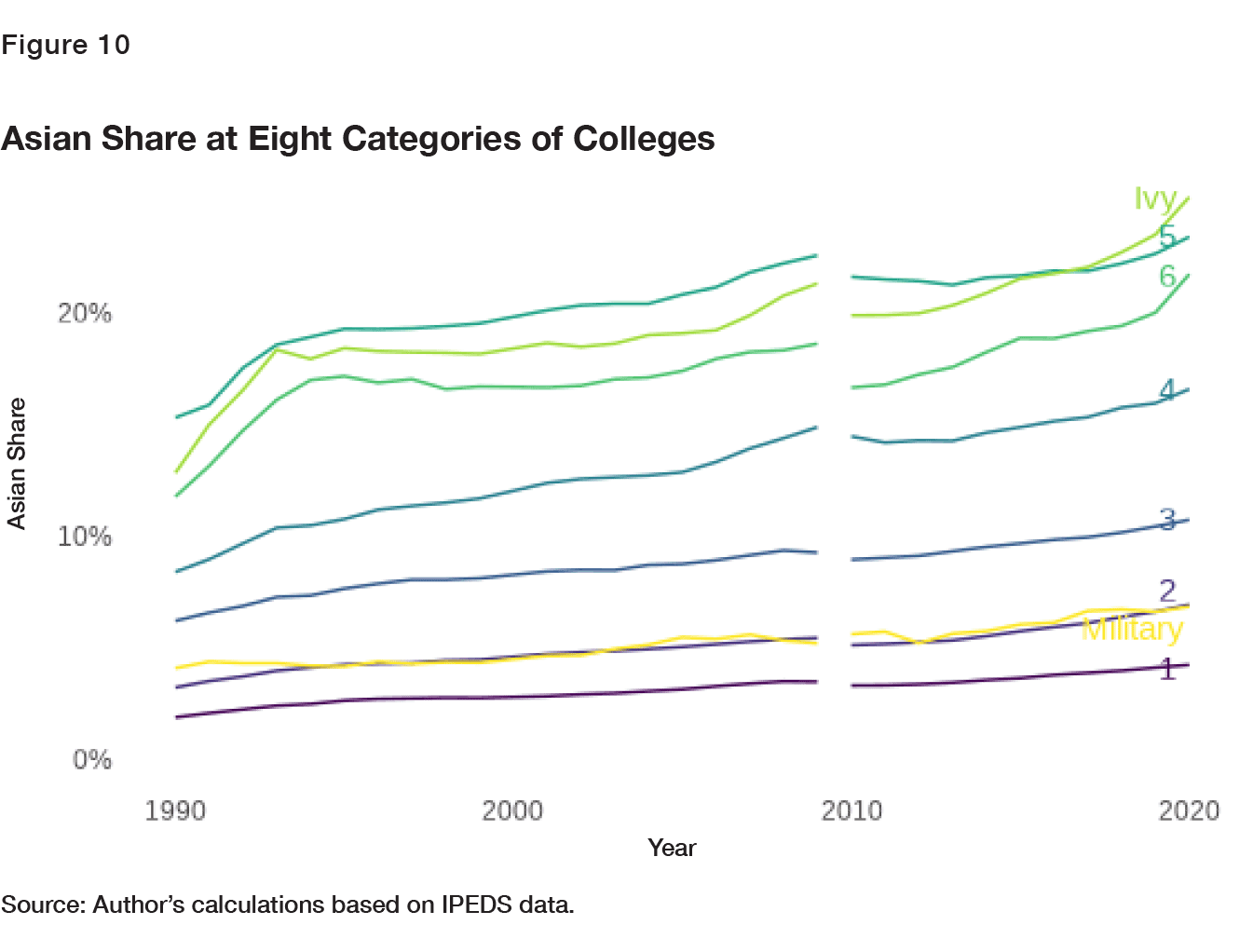
The results of the analysis, after following my nine rules, are shown in FIGURE 6. For most schools, we see roughly the “fanning out” we would expect based on the statistical realities outlined above. But at highly selective and Ivy League schools, we see very curious trends.
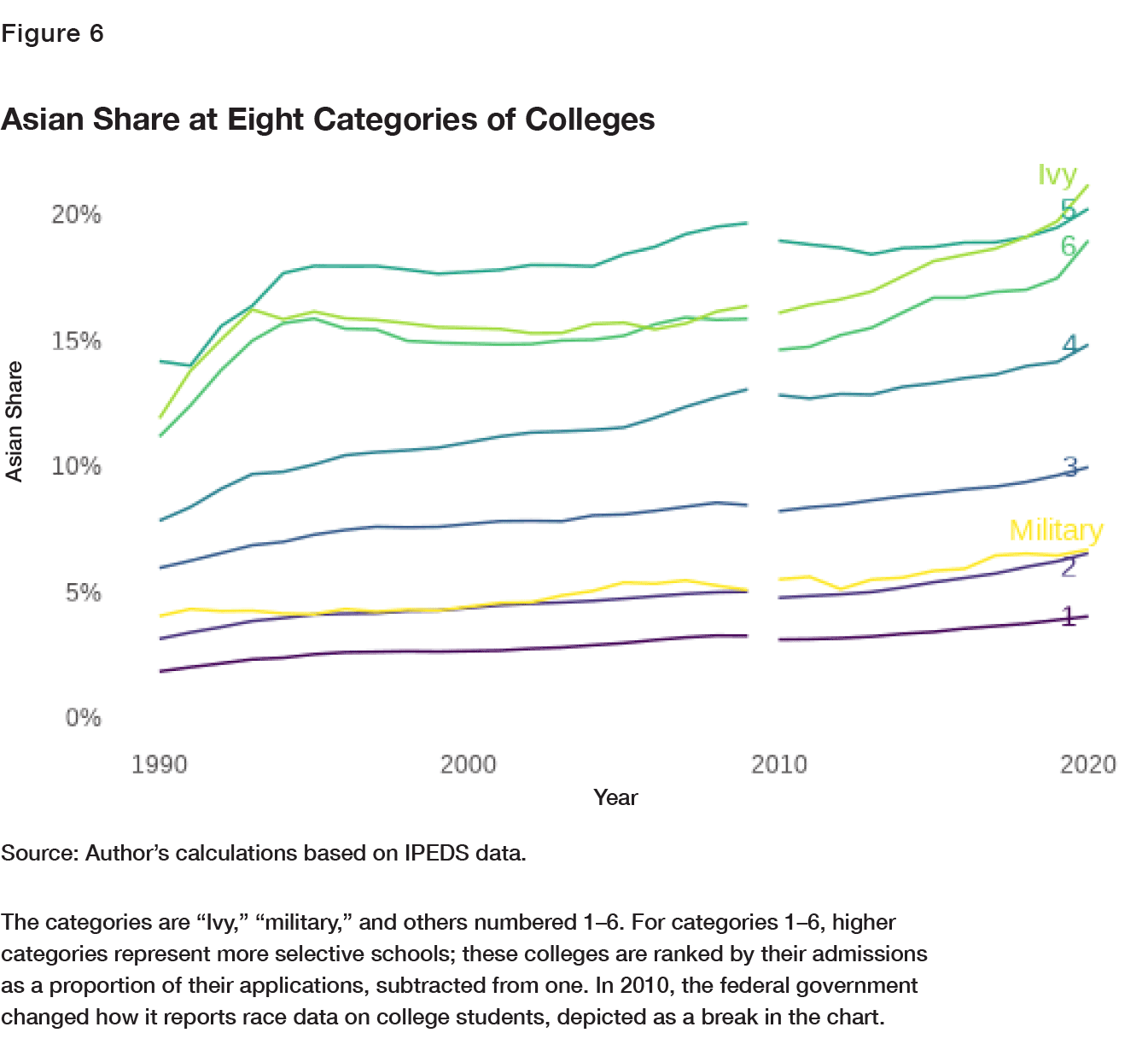
In the early 1990s, the reported Asian share at these schools increased remarkably quickly. (Interestingly, this period came on the heels of a largely forgotten series of scandals involving claims of anti-Asian discrimination in the mid-to-late 1980s, allegations that set off an internal probe at Stanford University, as well as Education Department investigations of Harvard, the University of California, Los Angeles, and the University of California, Berkeley.)[47] After that, these schools’ shares of Asian students appeared to hit a ceiling, holding roughly steady for the next 10 to 15 years. Yet they then crept upward again, with the renewed increase especially pronounced in the Ivy League. The timing roughly coincides with the new burst of attention given to the problem, though for some schools, it appears to start earlier. As discussed above, trends in “race unknown” identifications might also have some role in these patterns (even when such identifications are removed from the denominators, as in Appendix 1). But because that category rose gradually until 2010 and then rapidly declined under the new system, this possibility is a double-edged sword in terms of the full 30-year trend: To the extent that the unidentified students were disproportionately Asian, the stagnant period should look less stagnant, but the later increase should be flatter as well. A version of this possibility is crudely sketched out in the final two charts in Appendix 1.
To continue digging into the data as provided, however, FIGURE 7 is a look at the Ivies schoolby- school, providing an updated version of the viral American Conservative chart. Asian enrollment stopped climbing at these schools in the mid-1990s, and during the 2000s, the schools converged into that weirdly narrow range of around 15%. In the 2010s, however, Asian enrollment started going up again. (When race-unknown and nonresident-alien students are removed from the denominators, as they are in Appendix 1, the range in the mid-2000s moves up a few points, centering closer to 20%.)
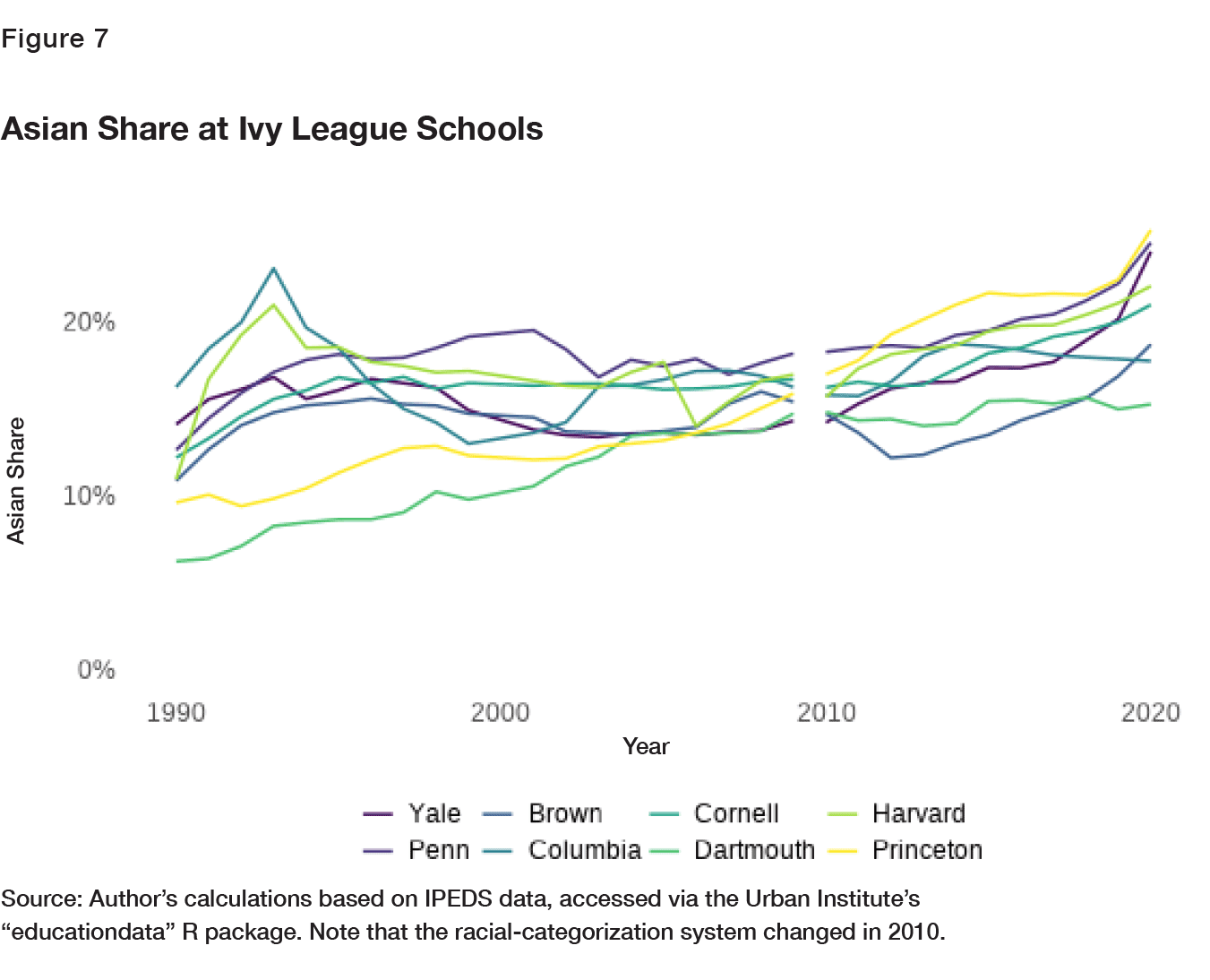
FIGURE 8 documents the non-Ivy colleges that reject at least four-fifths of their applicants, though it’s not possible to label every single college in a readable manner. Caltech jumps out with an Asian share around 40% in recent years, though I would caution against seeing it as an all-purpose control group representing what happens at elite schools without affirmative action. (Caltech focuses on science and engineering, where high math scores are especially valued, and is located in California, a state with an especially high Asian population.)[48] Trends at the other schools vary, though there’s a general flatness during the late 1990s and 2000s and an uptick in the last decade, as seen in the Ivies.
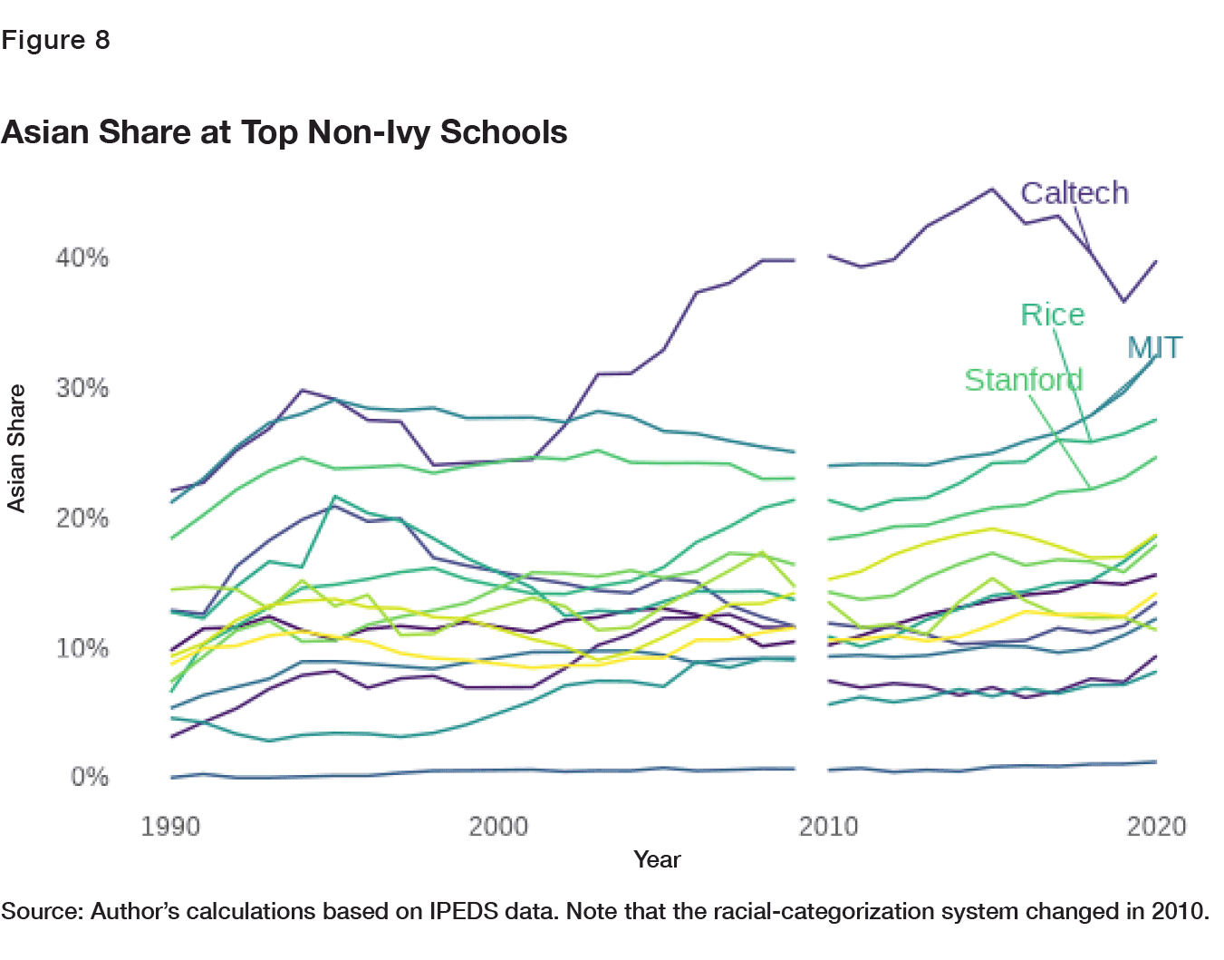
Astute readers may have noticed, in FIGURE 6, that the second-most-selective non-Ivy category (No. 5) consistently has a higher Asian share than the top non-Ivy category (No. 6), a break from the broader pattern that more selective schools have higher Asian shares. There are too many schools in this category to plot them individually, but it’s worth noting several that routinely have an Asian share near or above 30%: UC-Berkeley, UCLA, Baruch College (part of the City University of New York system), and in recent years, Carnegie Mellon. Berkeley and UCLA are the two largest schools in the category, enrolling about 30,000 undergrads each and together constituting 20% of all the students in this group of schools.[49] They are also public schools in California, which banned affirmative action in the 1990s and, again, has a high Asian population.[50]
Ranking Schools by Test Scores
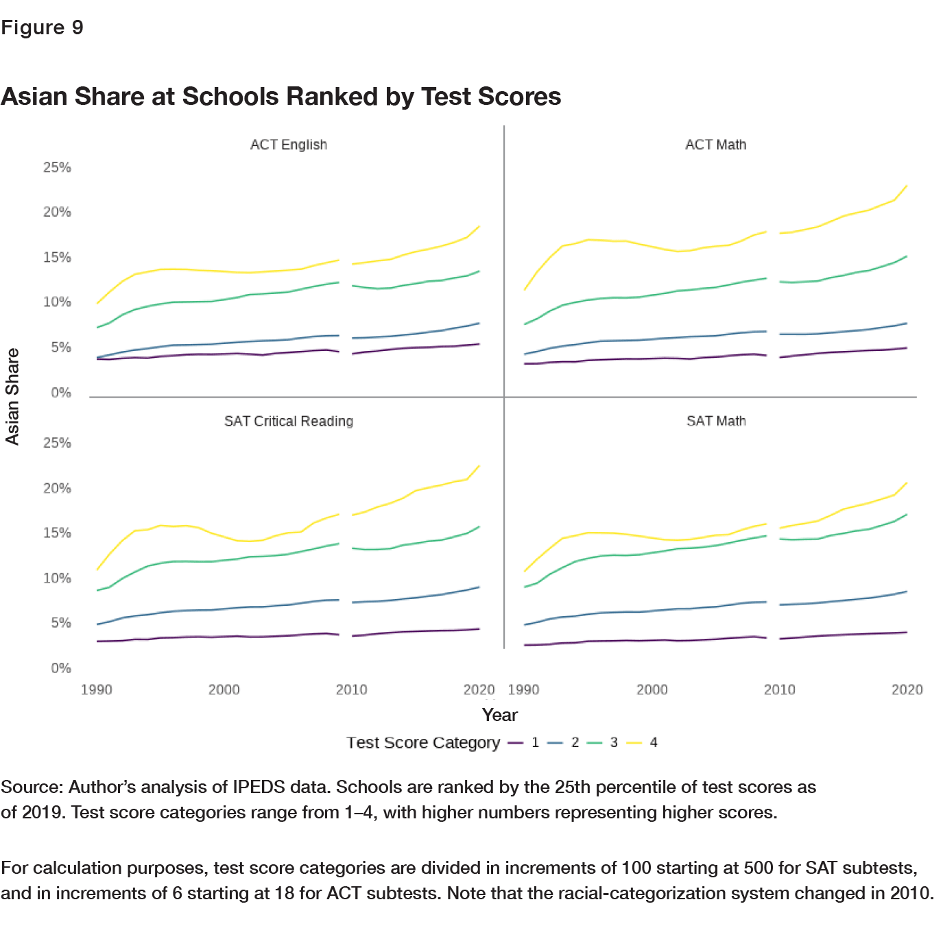
As noted above, classifying schools based on the test scores of their students poses difficulties when assessing trends in Asian-American enrollment. Schools that rely most heavily on test scores will necessarily rely less on other factors, including race—the variable we’re most interested in. But it is worth briefly repeating our exercise while sorting schools by their 25th percentiles of SAT math, SAT critical reading, ACT math, and ACT English scores as of 2019, rather than selectivity in admissions. This is illustrated in FIGURE 9 and provides a check on the results above, with school quality measured four additional ways.
I chose the 25th percentile rather than the 75th—both of which are available, though for a smaller sample of schools than admissions data are—because it shows what a student needs to be basically competitive with his classmates, as opposed to being a cut above most other students at the school. I categorized schools by 2019 scores because that’s the most recent year available—allowing us to see historical trends at the schools that are at the top of the pack today—and because combining all years and discarding schools with missing data, as done for admissions data, would hugely reduce the sample size. (Even relying on 2019 test scores alone, I have slightly fewer schools for these analyses than for the ones based on admissions selectivity.) Roughly matching the tests’ standard deviations and typical ranges for the schools in the sample, I set the cut points for the SAT subtests in increments of 100 starting at 500, while ACT cut points start at 18 and run in increments of six. If a school’s 25th percentile score is exactly on a cut point, it’s assigned to the lower category.
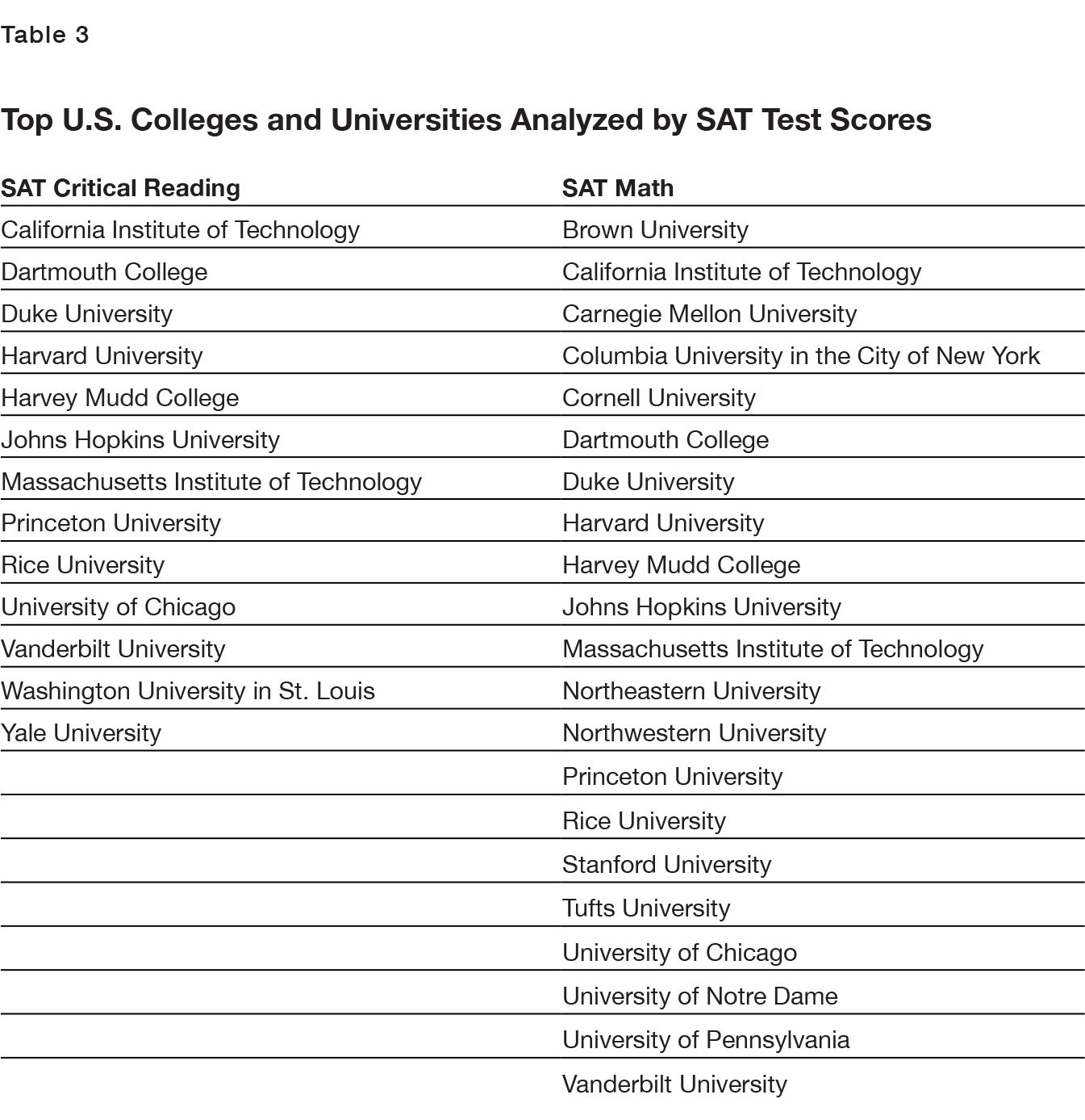
The groupings vary by test, but the top two categories tend to include about 125 schools combined; the very top groups for each test, which vary in size from 13 to 48 colleges, are fully listed in Appendix 2. The variation in these top groups’ sizes can be seen as a feature, not a bug, as it shows the results’ robustness to cutoffs of varying exclusivity when selecting the “best” schools.
This gives an overall similar result. The expected “fanning out” effect is obvious for most types of schools, but the very top schools in FIGURE 9 show the now-familiar pattern of fast growth, ceiling, then resumed increase. Interestingly, though, the turnaround in Asian admissions begins a bit earlier in this way of sorting the schools. Note that the outright dip around the turn of the century, while striking here, is less evident in the alternative analysis with no-race numbers removed from the denominators—see Appendix 1—and is exacerbated by large but gradual swings in the number of Asian students reported by the University of Chicago.
Conclusion
My analysis here is descriptive and does not prove discrimination at any particular school; again, university admissions are an opaque process, making it hard to tell why some students were admitted and others were not, unless one has access to a specific school’s records. Further, in this report, I have noted several factors that might provide legitimate explanations for at least some differences in Asian enrollment across schools and over time. For example, Asian students outpace their peers more in math than in language skills; colleges’ selection criteria can change over time for legitimate reasons; and the Asian population’s geographic distribution, with a heavy presence in California, will affect which schools Asian students attend.
Nonetheless, the aggregate data reported here suggest that something odd happened at elite schools in general over the past two decades. While the Asian share of the college-age population grew steadily, and was clearly reflected in the percent of Asians at many types of colleges, not to mention several measures of academic achievement, that percent at the most elite colleges stalled for years—and then, around 10 to 15 years ago, started growing again.
Appendix 1
“Race Unknown” and Nonresident Alien Students Removed
The following figures re-create my analysis after removing students who are recorded as “race unknown” and nonresident aliens from the denominator.


Nonresident Alien Students Removed and 30–40% of “Race-Unknown” Assumed Asian
In the following figures, nonresident aliens are still removed from the denominator, but instead of removing “race unknown” students as well, I arbitrarily assume 30% (FIGURE 14) or 40% (FIGURE 15) of them are Asian, which is well above the Asian share of students with known races in any category during the stagnant period around 2000. As expected, this subtly pushes up the trends at selective schools in the 2000s and slightly flattens those trends in the early 2010s. (More extreme assumptions can exaggerate these effects but also tend to create rapid, unnatural declines in the 2010s.)
Finding a rigorous way of estimating how many of these students are Asian school-by-school and year-by-year is a promising area for future research—though it’s worth noting that if Asian students get into top colleges by obscuring their races, it’s a tricky question how to treat these students in evaluating the schools’ policies.


Appendix 2
List of Most Selective U.S. Colleges and Universities Used in the Analysis


About the Author
Robert VerBruggen is a fellow at the Manhattan Institute where he provides policy research, writes for City Journal, and contributes to special projects and initiatives in the president’s office. Having held roles as deputy managing editor of National Review, managing editor of the American Conservative, editor at RealClearPolicy, and assistant book editor at the Washington Times, VerBruggen writes on a wide array of issues including economic policy, public finance, health care, education, family policy, cancel culture, and public safety. VerBruggen was a Phillips Foundation Journalism Fellow in 2009 and a 2005 winner of the Chicago Headline Club Peter Lisagor Award. He holds a BA in journalism and political science from Northwestern University.
Endnotes
Are you interested in supporting the Manhattan Institute’s public-interest research and journalism? As a 501(c)(3) nonprofit, donations in support of MI and its scholars’ work are fully tax-deductible as provided by law (EIN #13-2912529).